
Figure 1. Average counts by week on the public eBird checklists of Cackling (blue line) and Canada Geese in ten Colorado counties straddling the I-25 corridor from Larimer and Weld counties south through Pueblo County. Data are from Larimer, Weld, Boulder, Broomfield, Adams, Arapahoe, Jefferson, Douglas, El Paso, and Pueblo counties. In eBird, "weeks" begin on the 1st, 8th, 15th, and 22nd, with the last week of each month incorporating however many days are in the month after the 21st. Thus, the range of time in that last week spans 7.25-9.00 days, depending on the month. Counts of Cackling Goose in the area considered span the range 0-115,000, while counts of Canada Goose span the range 0-20,000. All 366,606 public eBird checklists (as of 23 Feb 2019) from the defined area were used to generate this chart. Click on figures to see larger versions.
While many eBirders know at least the basics of entering their data into the eBird database, I have found that relatively few have much in the way of knowledge about extracting information from the database, such as that presented in Fig. 1, above. That figure shows quite graphically (pardon the pun) that Cackling Goose greatly outnumbers Canada Goose nearly the entire time that the species occurs regularly in the area, a fact that many birders seem not to know. Since these sorts of data products are the entire reason behind eBird's existence, this post illustrates the ease with which anyone may extract such. The results of eBird data mining can assist in understanding of occurrence patterns of birds in many parts of the world.
While occurrence graphs such as that presented above might seem difficult to make, the task is really quite simple, as the eBird output engine does all the heavy lifting. All one needs do is to tell eBird what one wants to see in the way of such data presentations, assuming that the facility exists in eBird. The rest of this post will present a visual step-by-step instruction of the process. Reading these instructions will take much, much longer than the actual output process takes. Note that I include a screen capture of each step in the process, with examples for most steps, of both computer (laptop or desktop) and phone (iOs version only) screens. In all of the figures, the phone example is on the right side (if present). Additionally, pink arrows are included to direct your attention to the next step in the process.
STEP 1

Figure 2. After going to the eBird home page (ebird.org), one will see the important bits as presented in the figure. On a computer, click on the Explore link; on a phone, tap on the menu icon in the upper right and then tap on Explore.
STEP 2
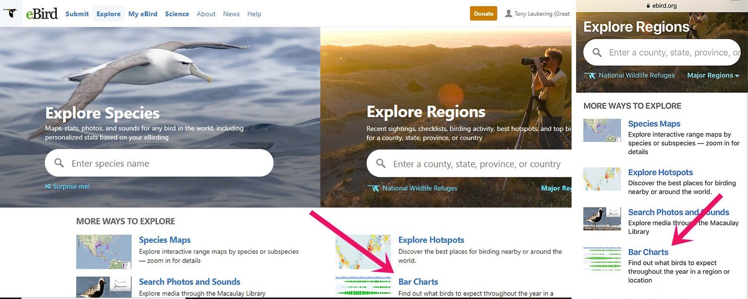
Figure 3. On the Explore page, click/tap on the Bar Charts link. (Say "hi" to Marshall Iliff of eBird HQ.)
STEP 3

STEP 4

STEP 5

STEP 6


Figures 7a and 7b. This page shows three graphs (you might have to scroll if you view the page on your computer in landscape mode) pon clicking on the Cackling Goose graph icon in the previous step. The uppermost graph is a bar graph (in green) and the second is a line graph (in blue). Both show the frequency of detection of Cackling Goose on the public eBird checklists of the region of interest. The bottom graph is a bar graph showing the weekly sample size of public checklists informing on the line graph, above (and recall that those individual weekly sample sizes total the all-time sample size of 366,606 public checklists from the ten counties selected, as noted in Fig. 1). Though your eyes might immediately go to the line graph, both frequency graphs and the sample-size graph are important. However, at this step, what is truly important is presented in Fig. 7b, the arrow pointing to the Change Species button. Click/tap that button.
STEP 7


STEP 8

Now that we've gotten both species that we wanted to investigate into the graphs, it is time to explain the various data-presentation options. The pink arrow in Fig. 9 indicates that of the six data-presentation options, we are looking at the frequency data. This graph indicates that even when both species are present in the region of interest, Canada Goose is reported more often, almost certainly because it is found at more locations in the region. To get to the data presentation that is presented in Fig. 1 (at the top of this post), we will need to click on the Average Count tab (at the opposite end of tabs from the Frequency tab). If you do not understand what a particular tab presents, you can always click on the "What is..." link in the bottom-left of the screen for an explanation. Note: On the Frequency tab, the sample-size graph (the bottom graph) presents, as noted in the caption to Fig. 1, the number of public eBird checklists from the region of interest and throughout the time period of interest. Note: The sample-size checklist on all other tabs presents only the number of checklists on which the individual species was/were recorded (thus does not include zero counts).
Finally, once onto the screen presented in Fig. 9, one can change the time span used, the species, and/or the region of interest. The ease with which you can change the facets makes it easy to compare occurrence patterns of different areas -- say, eastern plains vs. West Slope, different time periods -- say, the 1990s vs. the 2000s, or, as here, a couple species of geese (one can compare as many as five species). You can also get at this facility from the Region option on the Explore tab.
No comments:
Post a Comment